In celebration of the seminal sci-fi horror movie Alien’s 45th anniversary, Ridley Scott’s film is back in movie theaters. I saw it over the weekend, and even though it’s a movie I’ve seen countless times —on a laptop, on a plane, and on the TV, this was my first time seeing it on the big screen. Almost half a century after its release, I was in awe at just how good the movie still looks, which is in large part thanks to its timeless set and costume design.
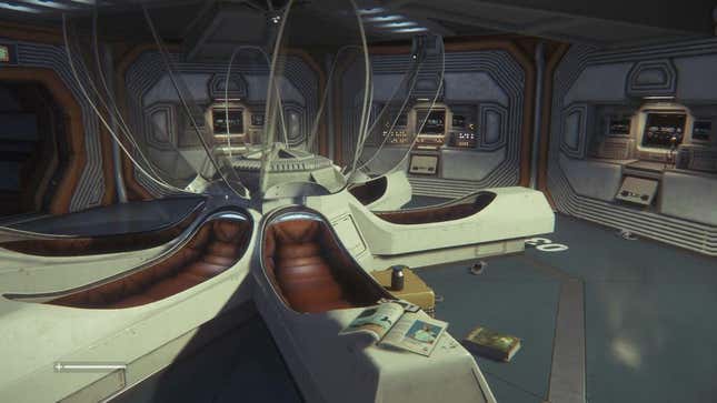
Seeing Alien again in such a grand way led me to think about Alien: Isolation, the nearly ten-year-old video game sequel to the film. Like its inspiration, Isolation holds up surprisingly well so many years after its initial release and highlights just how important art design is in establishing a coherent and consistent visual identity.
It must first be acknowledged that one of Alien’s biggest strengths Alient is its use of practical effects. Time and time again it has been proven to many that practical effects hold up better and longer than CGI. Big MCU movies from only a handful of years ago have aged like milk, but the sickly triceratops in 1993’s Jurassic Park still dazzles.
Alien’s sets and xenomorph still look great all these years later because they feel real—and they were, as most everything in the film is something the actors can interact with physically. That is even true of the titular monster, which thanks to the director’s clever camerawork, we only get glimpses of until the film’s climax.
This is supported by a concrete artistic vision for the film. There is a retro-futurist touch to everything in Alien, but it feels integral to how the world works. It’s a capitalist space-faring future dominated by corporations, and the setting of the Nostromo, a mining ship, feels truly industrial and utilitarian. Even old-tech like the CRTs that we see in the movie are used in such a way that separates them from their real-world origin, giving them a place within the film and its sci-fi world. Having such an identifiable artistic direction gave Alien: Isolation a leg up in development.
Developed by Creative Assembly —known for the Total War series— Alien: Isolation released in 2014. It was (and remains) a shockingly confident entry in the franchise, one that stands shoulder-to-shoulder with the films. That starts with its story, which positions Isolation as a direct sequel to the original film. Taking place 15 years after Alien, Isolation tells the story of Amanda Ripley, daughter of film protagonist Ellen, as she recovers the flight recorder of the Nostromo and learns about the fate of her mother’s ship. This narrative—as well as the game’s intense survival horror gameplay— make the game the film’s most “true” sequel, not all the other films that have come since. Like the protagonist Amanda is to Ellen, Isolation is the child of the original Alien. It also has the looks to prove it.

During development, Creative Assembly was provided with three terabytes of data about the original film’s production by Fox. That included concept art, costume photography, and the film’s sound effect recordings. “It was a proper gold mine,” said game artist John Mckellan during a 2014 event hosted by MCV/Develop. These resources allowed the dev team to break down every part of the movie and its world, then reconstruct it for Isolation.
While so many games dedicated to realistic graphics age poorly, Isolation’s art direction keeps it feeling as fresh as ever. In that way, it reminds me of Mirror’s Edge, the 2008 parkour game whose striking visual design is often pointed to as an example of how good art design will outlast realism every time. Even with the realistic graphics of Isolation, which aren’t up to modern standards, they somehow seem more alive and real thanks to the rock-solid art design first established by Alien in 1979.
.
